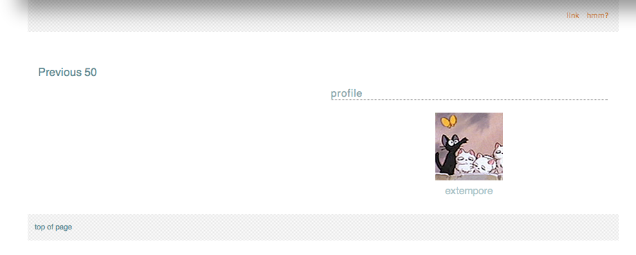
[personal profile] misbegotten
Hiya! I'm a CSS noob and most of what I've learned thus far is trial and error attempts at implementing suggestions for custom CSS that I've seen in this community.

I'm playing around with Fluid Measure on my journal and have a couple of questions. Thank you for any help you can give!:

1) Is it possible to put the Navigation module in a header? Or do I need to pick a different style to do that? That's a dealbreaker for me.

(ETA: fixed! thanks to [personal profile] althea_valara) 2) The space (container? IDEK) around the modules is showing black on my desktop (but not on mobile). I can't figure out where to change that.

Area around modules is black
[personal profile] bcboomerangs
I currently have Elegant Notebook for Gold Leaf - and I'm trying to get rid of the "Network" link in my navigation links. I currently have a gap there because I removed the text, but I don't like that open space.

Any help?

UPDATE: This has been fixed. Thank you all for your help!
[personal profile] 6thirty
Hi again. It's me, Syx, and I'm trying to get rid of the underline under the navigation links. I also want to know where I can fix the size and font-size of the navigation bar too.

Here is the code:


Could you please help me figure it out? There may be an excessive amount of code when dealing with navigation bar and navi-links section.
[personal profile] ex_awakened208
Would it be possible to merge the "previous" and "next" links with the main navigation that has the "recent entries"/"read page"/"tags", etc links in it?

The end result I am looking for is a header navigation that goes in this order:

previous | recent entries | archive | read | tags | info | next

I would prefer if the previous/next links only show up if there are actually entries before/afterward.

I hope that was clear enough! Thanks in advance.
[personal profile] extempore
Hello fellow style addicts!

I recently moved in from LJ and I'm in the process of recreating my journal layout at DW. I'm using the Brittle layout and trial/error my way through the design. ;) Most things I managed to work out by myself, but there are a few points I can't seem to find a solution for. Hopefully someone will be able to point me in the right direction. Additionally, I'm not sure what tags would be appropriate for this post. I'd be relieved, if the mods could handle that. ^^;

1.
My header looks like this. What I'd like to have is instead of the journal name/page title to show a simple link menu I can freely configure, such as:
profile  |  circles  |  calendar  |  link a  |  link b
I found in this lovely community already how to get rid of the page title etc. What I don't know is how I could put links there instead, and perhaps my profile icon in a smaller size. --- Partially solved!

2.
I'd like to move "Previous 50" to the right and to change the font size. So far I only managed to find out how to change the color. I'd like to do the same on the bottom of the page. (Currently the profile module sits there as well. I disabled it for now, because my first plan had been to put it in the header, which didn't work and the entire thing would have been too big for the top of my page anyway.) --- SOLVED!

3.
Is there a way to (a) change the font size of user names independently from the font size for date/time? Also, is there a way to (b) place the user names below their icons in such a way that they behave "intelligently", i.e. have line breaks, if the name length exceeds a certain amount of letters? This is mainly interesting for communities when you have "userblabla posted in communityblabla". I found out how to change the positioning in general, but I assume the user name would have to be withing the icon layer to be confined to it and for the entry text to not overlap it, and I couldn't figure out how to do that or how to add another box below the icon in which I could put the user name. --- Part (a) solved!


Thank you in advance for any help you can offer me! (Also: please ignore the white page background, I'll be adding a background image once everything sits on its right place.)

(no subject)

Feb. 21st, 2012 11:29 am
unicorn: a unicorn skull. (Default)
[personal profile] unicorn
Hey guys. On my journal right now I'm trying to change the color of the bar around the "top of the page" footer link - for some reason I can't get it off of the pale blue it's on now and (preferably) change it to a gray that matches the other navigation stuff.

Also, the other navigation links (recent entries, archive, reading, etc) are all left-aligned on their bar, and I can't figure out how to get them to center instead.

I'm using a tweaked version of this code, if that makes anything clearer. Thanks in advance for your help!
[personal profile] alovelyburn
Apologies if my questions are ridiculous - I've only been on DW for a short time, and am not yet used to style-making here.

So, okay, I've recently imported a community that I run from LJ to DW, and while I was initially using a port of Flexible Squares, I've decided to be ambitious and try to replicate it as closely as possible on a native DW style so we can use all the cool features. For the most part it's working, but there are still some quirks I don't know how to fix, or if I can fix them. So.

Layout: Tabula Rasa, style sheet disabled.
Original layout: [community profile] scorched ([livejournal.com profile] scorched to see it in its original, LJ form)
Current layout: [community profile] scorched_test

PROBLEM 1: The sidebar profile. I'd like to remove the header, center the icon and put the icon links in a horizontal list under the icon, preferably without that underline that I can't seem to get rid of. ¬_¬ [PROBLEM SOLVED]

PROBLEM 2: Change the link list/tag list on the sidebar (and the nav links in the header, for that matter) to a more blocklike display. (Visuals here: the way highlighted links look now - the way I'd like them to look. navlinks highlighted as i'd like - currently they don't highlight at all.) [PROBLEM SOLVED]

PROBLEM 3: Make the tags header match the rest of the headers. Not sure why this isn't happening now. [PROBLEM SOLVED]

PROBLEM 4: In general, I'd like to reduce the margin between the link lists (both Links and Tags) and the left side of the sidebar - can't figure out how to change that, either. [PROBLEM SOLVED]

PROBLEM 5: The icon and username. This is the bane of my life - is it possible to move the icon up to overlap with the title bar, and the username to, well, under the icon? (here is what I'm going for and here is what I currently have). [PROBLEM SOLVED] (I ended up using a combination of tricks from the comments here and altering the theme layer.)

PROBLEM 6: Also visible in the above pictures, the subject line and datetime. Nothing I do seems to move the datetime from the left to the right, and is there a way to put it ABOVE the subject line instead of under? [PROBLEM SOLVED] - kind of. I couldnt get the date to work properly above the subject so i tucked it in under. Either way, it's fine.

PROBLEM 7: Is there any way to get the sidebar to extend to the bottom of the page and the .pagetop link to the bottom, as well? as seen here, the link currently just hangs out at the bottom of the shortest column (also seen here) which is sort of awkward, and i'd prefer the sidebar continue long as seen on [community profile] scorched_ooc.

STRANGE RANDOM BONUS PROBLEM: If you go to [community profile] scorched_test you'll find that clicking a title link makes the title flash dark blue while active, as do the navlinks in the header. I CAN'T MAKE THEM STOP DOING THAT. DX I've tried various stylings on a:active for .header, .entry-title, even the general a:active but nothing seems to change it.

My current CSS, which is a bit of a frankenstein mess at the moment, my apologies.


I do realize it's a different style altogether and not everything I'd like to do may even be possible, SO if that's the case, please let me know so I can stop banging my head against it. >.<

Sorry to hit you guys with so much at once, but any help with any of these issues at all would be so appreciated I might explode.
[personal profile] myillusions
So I tried to do the color code change on the color for the nav. part of myillusions. I wanna get rid of that in the nav. part. Also how would I center the Navigation links. Is it also possible to center the comment links?
Thank you in advance
[personal profile] denig37
Layout: Halloween
by [personal profile] dancing_serpent  for ColorSide

Problem 1 : Header - I want to get rid of the journal title, subtitle and the "Recent" (or any nav title) SOLVED!
Problem 2 : Links at the bottom of entries (AKA edit entry, adit tags,...) - I want them to me white :-) SOLVED!
Problem 3 : Navi links - I want to move them under the header and centered. SOLVED!
Problem 4 : Subject of entries - is it possible to move them a few px to the right from the icon? And maybe making the font a bit bigger and in bold? SOLVED!
Problem 5 : I want to get rid of the "Previous 20/Next 20" links/bar at the top of the journal and only leaving the ones at the bottom. SOLVED!
Problem 6 : I would like to move everything (icon, subect, date, TEXT,...) a few px on BOTH sides from the border in the entries AND the module/sidebar. SOLVED!
Problem 7 : I would like to move the entries so when clicking on the "Reading/Friends" page (or any other for that matter) they would be at the same height as on the "Recent" page (AKA same distance from the header everywhere). SOLVED!


I'm totally new here and have no clue how to write CSS so if you managed to help me with these with some CSS coding or even just pointing me in the right direction and telling me what's possible and what not I would be super thankful and might possibly owe you my firstborn :-D
The DW confuses me and takes away my sleep :-( Please help! O.o

[personal profile] dhae_knight_1
I'm using Underworld for Crossroads, and the header is cooking my noodle. I would love to reduce the height of the header to... pretty much what's needed for the navigational elements, now I've figured out how to insert an image as title. I've checked the page source, but... either it's been way too long since I worked with CSS last, or the header elements are on an external style-sheet somewhere.

Can I do this at all, or do I need to make my very own style from scratch?

Also... I think I might like to move the navigation module to the left down just a smidgen. Anybody got pointers to that effect?

[personal profile] sharpiefan
Help!!

I've just set up a mirror community for one on LJ, and I want to move the nav links (recent entries/member posts/archive/profile) to the centre, under the header box.

Is there any way of doing that? And if so, could someone talk me through it - I'm not that confident with coding-type stuff.
[personal profile] molotov
I really hope someone can help me!

I'm using the port of Flexible Squares, and I brought my old layout with me. The problem is that it uses images for navigation. On LJ, the active page shows in the nav module like this:


But on DW, the active page disappears from the nav, leaving me with this:


I feel like I'm overlooking something.


Any help would be much appreciated!!
[personal profile] misstia
hi! i freely admit i have 'the dumbz'....i don't want to import my theme/style from LJ, i am okay with the one i found here on DW....i would like to customize the header though and i have zero clue how to do that and i tried to find some info in FAQs, etc and i might have been looking wrong???? (i totally was looking wrong!)

i am using 'purple' for my journal style....

i DID find the CSS code to remove the 'recent entries' from the header but didn't want to add that yet lest it interfere with future CSS code additions.....and i know i can get rid of the 'profile module' too once i get the header sorted out.....

i'd like to put my journal name in the center and then have links under it (within the header) for: profile, friend's page (reading page), link to my domain, archive....i think this is possible??? i did buy a premium account here (sooo impressed with DW and how they value their users! :) i just don't know how and got really confused trying to find out how to do this.....maybe i need a different style?

i do know html, i know enough CSS to fiddle with it, but can't write CSS on my own....so i hoping someone can direct me somewhere as i have searched, but obviously am not searching in the right place....i saw where i can import a LJ style/theme, but i just want to customize a DW one.....

thank you in advance!!!

ETA: Resolved!! THANK YOU!!! :-)
[personal profile] scarletseraph
[ETA]: Solved!

Hullo!

I'm not so much an LJ refugee as that I keep an outpost on DW just in case. My layout over there has a lot of personal customzations - it's not one of the public themes; it's something I did the graphics and colours for myself, and not being able to reproduce it has been one of the things that's kept me from wanting to be as active on DW as I am LJ.

Well, I only just tonight found out that there's a tutorial on importing LJ styles (this one here, using the instructions for a Mixit import). While I have the layers created and compiled okay, I have run into one minor(?) problem... On LJ, I'm using Expressive as my base, which I'd gotten the impression was more-or-less the same as Mixit so I thought it might work alright. Apparantly there are more differences than I realized, because while the basics of the layout are there, there are features that have shifted around - the links specific to each entry are now in vertical colums rather than horizontal lines, as are my header links, and my sidebar is appearing at the bottom of the page (after my entires). (That's probably an obvious enough explanation, but in case it's not, this is how it looks on DW, and this it how it looks on LJ).

I don't generally mind trying to tweak things when I know what it is what I actually need to tweak, but I don't have the kind of mind that'll let me paw through code and find the problem. I'm assuming it's either an issue in the CSS somewhere (though I could be wrong) or there's an adjustment I could make to the CSS to compensate for the base code, but it's all just too much like an algebra problem for me and my dyscalculia to figure out. :/ Does anyone have suggestions for what I might be able to do to fix it, or know of a fix that's already in use - preferably one that doesn't involve having to switch to Mixit on LJ, trying to recreate the layout there, and copying it back to here? (Or is there a local style that might be suited to rigging a similar look on DW? I did glance through the themes here, but didn't see anything that seemed to be a good fit. I'm not averse to some changes, but I'd like to keep my header graphic/page background and colours/etc - and a lot of the local styles also have entry boxes that get squashed due to my monitor's resolution being on the lower end.)

[ETA]: Getting the links onto their lines seems to be more-or-less handled, now, so I'm left with:

- The sidebar not positioning properly
- Entry tags vertical-columning (though I suspect I may know how to fix this eventually, if I play around with things enough - now that i see how the link lines were fixed)
[personal profile] runpunkrun
Hi folks, I'm using Modish set to two columns, but what I'd like to do is move one of my modules up to the top and have it display horizontally, which isn't an option in the wizard as far as I can see.

So my question is: Is it possible to make the navlink module horizontal? I want it directly under my header as a line of links, not the vertical stack in the sidebar it is now.

Any help is appreciated!
[personal profile] majesdane
I was wondering if anyone had a fix for this ... I was helping a friend ([personal profile] tiltingheartand), who wanted her DW layout to look exactly like her current one on LJ. The style she uses on LJ is "Quite Lickable," and I was able to find a coding adaption for a S2 layer style over here.

I haven't had any trouble tweaking small things here and there, but I can't seem to figure out out to hide the links for memories and tags in the sidebar. (For the record, I don't know how they're hidden on her LJ either, since I'm not very familiar with the QL style.) I tried using the two fixes suggested here, but neither of them has worked for me.

If anyone knows a way to fix this, I would be very much appreciative. :)

Layer coding:


Child layer coding:

(no subject)

Dec. 8th, 2011 06:13 pm
icarly: (Default)
[personal profile] icarly
I'm trying to use THIS layout from LJ. But if you look at my journal, [personal profile] icarly you can see it's not exactly the same. I'm not sure how to get rid of the TAGS and MEMORIES links at the top, can someone help?

Hey everyone!

Oct. 27th, 2011 04:57 pm
tenacitas: (Default)
[personal profile] tenacitas
I'm brand new to DW, I used to be around LJ a lot, but after their latest attempt at trying to "fix" things that did not need to be fixed, I felt like it was the very last drop and decided to jump ship-- As I'm sure many more will, after all, why are we paying people to only make our life more difficult with their "updates", right?

But here is the thing: I don't know anything (and I truly mean anything) about CSS or HTML.

Yes, I was able to find a tutorial made by a very, very kind soul, explaining how to pass the Flexible Squares layout over here-- Something that I have accomplished! Same with the custom CSS I used to have, back then.

Problem is, for some reason, in the navigation bar at the header, besides the usual "Recent Posts", "Friends", "Archive" and "Profile" that we can change the texts for, I now also have a "Tags" and "Memories" on the bar.

I thought I could possibly figure out how to make them disappear on my own, but, well, turns out I can't.

The case in question is not on this account, which I will be "prettifying", later today, but if someone could give me some lights as to how to make those two options disappear from the navigation bar (or, at least, how to change the text for them) I would appreciate tons!

Thanks a lot in advance!
[personal profile] valiha
Hi all, I just tried to edit some of the navlinks text in customize journal style (http://www.dreamwidth.org/customize/options?group=text), but navigation, entry and options aren't clickable, and neither is expand all. What might be the reason for this?
[personal profile] feathertail
Okay ... I can style all the navmenu items using .module-navlinks ul li a, but I'm trying to only style one of them. Like, say, the last one on the right on [community profile] becomeyourfursona, with the custom1 class, that was added using a custom layer.

I've tried .module-navlinks .custom1 ul li a and various other permutations, including just straight .custom1 a, but none of it works. (It doesn't work on the other, non-custom menu items, either.) Firebug doesn't even show the rules as having been overridden; they just aren't there.

Is this is something I need S2 for -- and if so, where I can find out how to do CSS using S2? Because I remember earlier I tried changing the names of the menu items, and it only worked for "Recent Entries" and didn't work for "Reading." I suspect that menu items that have been modded in some way using a custom layer can't be customized further using the front-end.

Profile

Dreamwidth style system discussion

April 2025

S M T W T F S
  12345
6 78910 1112
13 141516171819
2021 2223242526
27282930   

Syndicate

RSS Atom

Style Credit

Expand Cut Tags

No cut tags
Page generated May. 28th, 2025 03:14 am
Powered by Dreamwidth Studios