[personal profile] musyc
I've been gone from DW for a couple of years, and in that time it seems some people have started using details instead of cut to make a pseudo-cut tag. It messes with me visually on my reading page.

I have a custom layer and can edit bits and pieces, but I've managed to confuse myself as to whether I need to edit the layer or throw some custom css on.

I want to make the 'details' span visually identical to a cut tag - bold, underline, parentheses. I've skimmed old entries here for cut tags, and I have a couple of thoughts mulling. I can probably do the B and U easily enough, and match the color to my entry-links (#1f142e), but I'm banging my head on how to get the parentheses in place. Matching the arrow would be nice, too, but it doesn't bother me as much as the lack of the cut-tag visual elements.

screenclip example images:
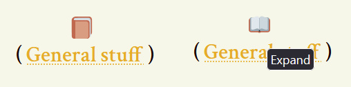
"Details" as pseudo-cut:

Actual cut:
[personal profile] haptalaon

I made a little open-and-shut book for journal cuts - the book opens on hover, stays open when the cut is open, then closes on hover and if you click it and the cut is closed it's shut. The cut text and icon are both centered. Like this!

a screenshot of the finished effect just described

Based on code by[personal profile] tropicsbear  here, updated from the original here by[personal profile] rise

You can download my book icons here - they're based on the open source twitter emoji [Closed Book / Open Book]. Please don't hotlink - download then re-upload to your own image hosting. What other before-and-after emoki could you use?

They are not pictures - they are in .svg format, a set of code instructions for displaying images. You can edit them in a dedicated svg editor, or in any program which edits text files (!). Use a .svg editor if you want to add symbols or change the design - or make your own pixel art - but if you just want to change the colour of the book, it's easy. Open the .svg source code in a text editor, then use find&replace to swap the color hex codes for the colours you want. Currently, the dark brown is #C1694F and the light brown is #D99E82.

Code under the cut!

Read more... )
[personal profile] london_fan
Hello to all the lovely and helpful people here.

I recently ditched my old LJ-imported layout completely and switched to my first genuine Dreamwidth layout (Transmogrified) which I have customized to the best of my abilities ever since. However, (LJ-)CUTS have become my new nemesis, since they continue to defy a lot of my attempts at customization. I managed to exchange the Expand/Collapse/Collapse-End images, but there are two more things I'd like to change:

The text colour of the cut link and the brackets/braces around it )

Anyway, I am using a custom theme layer and I'm reasonably comfortable with overriding S2 Core functions or tackling some CSS. I just need help what to change here, since neither "trial and error" nor combing through stuff with the page inspector have revealed any workable solutions so far and it's been giving me some headaches.

Any help would be highly appreciated!
[personal profile] judas_river
Hello, and thank you in advance for taking the time to read this. Some years ago, I sort of muddled my way through porting my style over from LiveJournal. However, there are a few minor issues that I can't seem to figure out on my own, and I'd love to finally address them. Would any of you wonderful people be able to help me?


My style info )


My problems )


If you got all the way through that, you deserve an award haha. Any help with any of these problems would be so deeply appreciated. What little I know about coding layouts is self-taught and spotty at best, so any and all explanations to accompany any help offered would be especially awesome, too. Thanks so much!
[personal profile] runpunkrun
Hi, do I have a fussy question for you:

The little cut-tag triangles never seem to line up with their parentheses in any style I've used. Previously I've been able to nudge them into place, but on my new layout for [community profile] fancake, they are off and the only way I can make them line up nicely causes a problem.

I did this:

span.cuttag a img {
margin-bottom: -6px !important;}


And it's fine...but if the entry ends with a cut tag, this creates a vertical scrollbar within the entry. Clearly this is because of my negative margin bottom. Is there a nice, honest way to do this that doesn't infringe on neighboring elements? That triangle needs to be nudged down a whole bunch.

Thank you!
[personal profile] tropicsbear
I just noticed that the cut expanders have changed after the code push, and my previous custom expanders have been replaced with the default ones. Has the code for customizing them changed? This is what I'm using now:

Cut Expander

Jun. 7th, 2013 11:11 pm
anaraine: A blue star shape, trailing ribbons of glitter against a black background, above the name Anaraine. (Default)
[personal profile] anaraine
I was trying to target the cut expander to just shrink the image a little bit (the code push finally pushed them over my "big, but I can deal" threshold to "too big, drawing too much of my attention"), and while I can change the opening expander, the closing expander remains kind of... huge.

Help, pretty please!


custom css:
.cuttag img { width:8px !important; }

entry with a cut!
http://anaraine.dreamwidth.org/2013/04/07/
[personal profile] rise
i was tweaking my own journal layout today out of boredom, and i think i've figured out a workable way to customize the triangles for expanding cut tags. contains css and pseudo-css code examples )

what do you all think?
[personal profile] nmsakura
I have a question: I would just like to ask how to go about formatting the Cut Tag? I've tried:

span.cuttag a
.cuttag a

and nothing happened. I would like to change the link style and remove the arrow (if possible).

Sorry, if this has been posted elsewhere. My search came up with no results.

Thanks,
- N
[personal profile] aldro
This may be a rather dumb and silly question, but I'm just wondering...

It looks like the little arrow that shows in front of a cut (the "Read more" cut) is set slightly higher than it's supposed to be. It kind of looks like it's floating in the air or something. I'm not sure if that's due to the layout I'm using, because I don't remember seeing this with my previous layouts. Or perhaps it's my eye sight that's going bad. Either way, I was just wondering how that's possible and if it can be changed. Yes, I'm aware that I am extemely nit-picky. :P
[personal profile] harukafics
I was told someone here might be able to help with my problem. :)

Is there any way to suppress the collapsable cut tags on a journal? I know you can suppress them for your own viewing, but is there a way to turn them off entirely? I love them on my regular journal, but they're messing up the counters on my fic journal. :(

I'm using the Drifting style.

Profile

Dreamwidth style system discussion

April 2025

S M T W T F S
  12345
6 78910 1112
13 141516171819
2021 2223242526
27282930   

Syndicate

RSS Atom

Style Credit

Expand Cut Tags

No cut tags
Page generated Jun. 3rd, 2025 12:56 pm
Powered by Dreamwidth Studios