[personal profile] monsterchild_lair
hi there! (wow, posting in a new community is scary, but you all seem super nice!) i'm jericho, i'm posting on behalf of my headmates because i can talk.

trying to make icons all appear on the left in both posts & comments )

thankyou so so much to anybody who read this, and especially anyone who tries to help out! (also i hope i did the tags right!) <3

~ jericho
[personal profile] blueshiftofdeath

I'm using [personal profile] tickletheory's [community profile] plainstyles Style 4 theme, and recently decided I wanted to make the icons bigger, plus make icons appear on my journal's recent entries page (not just my reading page). I ended up adding the following code:

css code )

This worked mostly great, except for some reason, it only displays correctly for public posts? For access-locked posts or posts with custom filters, the alignment is all off. I would think it's because of the little lock icon, but it doesn't happen to public stickies. I don't see any code specific to security level in any of the relevant layers.

I've been able to partially fix this by doing further adjustments to entry css based on security level, but it's breaking other things, and I feel like there must be some other option to make all the security levels display the same?

Does anyone know what's causing this, and/or how to fix it?

[personal profile] permutative
Hi, I'm using baud's layout that customizes Tabula Rasa. I was wondering how to fix the CSS so that it shows my user icon at the top of dreamwidth posts/entries along with displaying the icons of user comments. I would appreciate the help!

Here's my CSS:

[personal profile] hackitude
Hi guys!

I'm admittedly mostly super new at this stuff, so I apologise if this is really basic. I've been tinkering around with a custom layout (this one, by aliahan to be specific) trying to get it more in line with my desired outcome. After googling around for fixes, I finally got my reading page looking just the way I want it. (live preview, image preview)

My problem is this: the entry management links and entry interaction links in my journal entries don't display the same way. (live preview, image preview for a longer entry, and live preview, image preview for a really short entry.)

I'm using Tabula Rasa, which I know doesn't naturally display the entry management links and the entry interaction links in the same line (and boy it took me a while to figure out how to wrangle that and I'm still not sure my fix is the best one) on the reading page, so now I'm just like... stuck... basically...

I'm not sure if it's even possible to fix it on the too-short entries, other than making sure I don't create entries that are too short??

The other thing I wanted to do was remove the userpic and userpic column from the journal entries entirely (just on the journal entries mind, not on the reading page!) so that the body of each entry takes up the entirety of the white box area. I tried ".userpics { display: none; }" but that had no effect whatsoever, so. Yyyyeah.

Anyway, I'd be really grateful for any help that anyone can give! Here's my layers & css if it helps:


ETA: Oh also, if any one knows how to get the "(no subject)" line out of just my sticky entry, that would be tops... I figured out how to remove the "sticky" text but that was as far as I got... aha... hahaha. ha.

ETA 2: All solved, thank you!
[personal profile] redcinematics
Hi there! I'm currently using a ported version of Smooth Sailing and, since DW's retired the .bml aspect of links, I'm having trouble fixing my style to go to my userpics. It's been ages since .bml was retired, and this was one of my back-burner projects, but now that I'm fiddling with it I can't seem to figure out what values to stick in there!

My problem can be accurately summed by visiting my journal and clicking on my default userpic. I'm able to find the instances of allpics.bml in the ported sheet (three) but fixing it, well.. no luck so far! Any tips will imputed for test ASAP. =)

Solved! See comment! =)

Rounded icons

Jul. 23rd, 2013 04:10 pm
tropicsbear: Tadashi carrying Ainosuke bridal style (Default)
[personal profile] tropicsbear
The layout I'm currently using originally had the user icons for entries set not to display. I removed the display: none in the CSS, now my problem is that the user icons in entries don't match how they're displayed in the comments (rounded, gray border). Also, I'd like to move them up a bit too.

This is the code I'm using:


Thanks in advance for any help!
[personal profile] siliconsara
Sorry to bother [community profile] style_system again.

I noticed that when an entry bears the name and/or community at the top it messes up the position of the icon.

Here's the icon as seen from the reading, network and single entry page:

 photo userpicpositionreading_zps3e55d535.jpg

Though when the name (and community) are missing (for instance, on the recent entries view) the icon is positioned further down:

 photo userpicposition_zps8095aeb4.jpg

I removed my custom CSS to see if that was the problem, but it's still the same.

Any guidance please?
[personal profile] jana
In Tabula Rasa you can choose, via the wizard, the place of icons in entries and comments (left or right). So far so good. But how do you target a left-placed (or right-placed) icon with css? If I say, for instance, .entry .userpic {float: left;}, the icon will always be placed on the left side, no matter what you specify in the wizard.

I'm working on a layout/style and I'd like to style a left-placed icon somewhat different from a right-placed icon, depending on what people prefer. Plus I'd like the entry text to wrap around the icon which is easily done with 'float: left' and 'float: right'.

Any help would be appreciated.
[personal profile] jordannamorgan
Hello. I'm a fairly new LJ-to-DW migrant who knows nothing about CSS, and would like to tweak some little things. Some entries I found via the tags were extremely helpful to me (thank you!), but there are a couple of other adjustments I'd still like to make if possible.

I'm using the Ciel layout. (FWIW, no paid account yet, but that is imminent.) My questions are:

1. Is there a way to wrap the text around the userpic in my entries, instead of just having a long strip of empty space under the pics? (Problem resolved--thanks for the help!)

2. Is it possible to make userpics NOT appear on any comments? (Basically, what I'd like is to see only my own icons on my own recent entries page.) I've been able to remove userpics from my reading page, but not from comments. Currently I just have them shrunk to their smallest size via DW's options. (Thanks also for the answers to this!)

Merry Christmas, and thanks for any suggestions. :)
[personal profile] turlough
For the first time I'm trying to adapt a native DW style (Heads Up) for a comm instead of working with a ported-from-LJ one. I've been sticking to custom CSS and so far I seem to have managed to change most of the things I wasn't happy with. There are a couple of things I seem to be completely unable to fix however.

They both concern entry headers… )
[personal profile] alovelyburn
Apologies if my questions are ridiculous - I've only been on DW for a short time, and am not yet used to style-making here.

So, okay, I've recently imported a community that I run from LJ to DW, and while I was initially using a port of Flexible Squares, I've decided to be ambitious and try to replicate it as closely as possible on a native DW style so we can use all the cool features. For the most part it's working, but there are still some quirks I don't know how to fix, or if I can fix them. So.

Layout: Tabula Rasa, style sheet disabled.
Original layout: [community profile] scorched ([livejournal.com profile] scorched to see it in its original, LJ form)
Current layout: [community profile] scorched_test

PROBLEM 1: The sidebar profile. I'd like to remove the header, center the icon and put the icon links in a horizontal list under the icon, preferably without that underline that I can't seem to get rid of. ¬_¬ [PROBLEM SOLVED]

PROBLEM 2: Change the link list/tag list on the sidebar (and the nav links in the header, for that matter) to a more blocklike display. (Visuals here: the way highlighted links look now - the way I'd like them to look. navlinks highlighted as i'd like - currently they don't highlight at all.) [PROBLEM SOLVED]

PROBLEM 3: Make the tags header match the rest of the headers. Not sure why this isn't happening now. [PROBLEM SOLVED]

PROBLEM 4: In general, I'd like to reduce the margin between the link lists (both Links and Tags) and the left side of the sidebar - can't figure out how to change that, either. [PROBLEM SOLVED]

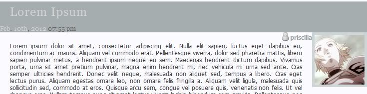
PROBLEM 5: The icon and username. This is the bane of my life - is it possible to move the icon up to overlap with the title bar, and the username to, well, under the icon? (here is what I'm going for and here is what I currently have). [PROBLEM SOLVED] (I ended up using a combination of tricks from the comments here and altering the theme layer.)

PROBLEM 6: Also visible in the above pictures, the subject line and datetime. Nothing I do seems to move the datetime from the left to the right, and is there a way to put it ABOVE the subject line instead of under? [PROBLEM SOLVED] - kind of. I couldnt get the date to work properly above the subject so i tucked it in under. Either way, it's fine.

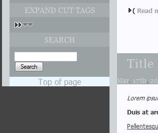
PROBLEM 7: Is there any way to get the sidebar to extend to the bottom of the page and the .pagetop link to the bottom, as well? as seen here, the link currently just hangs out at the bottom of the shortest column (also seen here) which is sort of awkward, and i'd prefer the sidebar continue long as seen on [community profile] scorched_ooc.

STRANGE RANDOM BONUS PROBLEM: If you go to [community profile] scorched_test you'll find that clicking a title link makes the title flash dark blue while active, as do the navlinks in the header. I CAN'T MAKE THEM STOP DOING THAT. DX I've tried various stylings on a:active for .header, .entry-title, even the general a:active but nothing seems to change it.

My current CSS, which is a bit of a frankenstein mess at the moment, my apologies.


I do realize it's a different style altogether and not everything I'd like to do may even be possible, SO if that's the case, please let me know so I can stop banging my head against it. >.<

Sorry to hit you guys with so much at once, but any help with any of these issues at all would be so appreciated I might explode.
[personal profile] marilla_pm67
Hello,

I hope this is the right place to ask.

I have a bunch of feed accounts on my friend page ... but they don't show any icons, it shouldn't be annoying, but it is for me. I would like to know if there's an override bit of code permitting to get a default icon showing up, or if there's a possibility on your end, to set up a default icon for the feed accounts? that would show up on the reading page.

Thanks in advance.

Sam.
[personal profile] magz
I'm attempting to poke together a layout using Paletteable, and was wondering if there was a way to move the username of the poster so it's right-aligned, opposite the timestamp on the entry. I've tried floating it and modifying the margins, but because of the order in which things print in the layout, the username gets stuck to the left of the user icon.

Is there a bit of code I could rearrange so that the poster prints first and then the user icon, which I could then toss into the theme layer? I've been looking through the Palettable and DW s2 source codes and unless I'm scrolling past it, I haven't found what I'm looking for so far.

Any suggestions?

[ETA] In the meantime I've done a messy bit of work with margins which seems to be working for now:

.poster, .entry-poster {
margin-top: -30px;
margin-right: -80px;
float: right;
}
[personal profile] vettysazzy

Another LJer who left over release 88...

I've got the Flexible Squares style (using this fix). It's all working fine, except usernames aren't displayed below userpics on my Reading Page, and the subject lines for entries aren't links. I'm assuming it's a CSS problem but I don't understand CSS in the slightest so any help would be fantastic!
[personal profile] sally_maria
I'm currently using the following CSS, which somebody posted a while ago, to put a userpic on RSS feeds on my reading page.

.journal-type-Y .userpic { background: url(http://i6.photobucket.com/albums/y241/sally_maria/Mood%20Theme/dreamsheep_rss.png) no-repeat;
width:100px;
height:100px;
background-color:#000; }


The only problem is that my style has userpics on the right, but this CSS makes the RSS userpic appear on the left, and it looks a little odd and takes up more screen - see on my reading page here.

Is there anything I can do to the CSS to make the userpic appear in the right place?

Thank you very much for any help you can give me.
[personal profile] aldro
Currently, my entry's text is wrapped around the userpic. This causes things like a blockquote to sort of slip behind the userpic. I would like to change it so that the text doesn't go beyond the alignment of the userpic, if that makes any sense. What do I need to edit in my CSS?

[personal profile] feathertail
  1. How do I make the userpics appear in Tabula Rasa? Edit: This fixed itself somehow, see below. Some clarification for the future would help though.

  2. What all would I need to do, in order to make that comm's style suitable for posting as a new Tabula Rasa layout on [site community profile] dreamscapes? I mean sans the comm-specific customizations. There's all kinds of stuff I'm still learning here, and things that I still need to style, but I'm not sure what the next step should be. (I was thinking of posting the code on Gitorious though.)

  3. What's involved in creating a new color layout for an existing theme? Because I was thinking of using Funky Circles for my personal journal, but it needs a new color scheme. I'm thinking "Peanut butter and chocolate."

About that first question: I Firebug-inspected the comments on [community profile] becomeyourfursona and on a journal that had visible userpics, and I couldn't see any CSS rules that seemed relevant. But after applying the following styles to .comment:
background: none repeat scroll 0 0 #EFEFEF;
margin: 3em 0 4.6em 0;
padding: 2.7em;
position: relative;
... the problem mysteriously solved itself. Any idea why? Was the text element somehow overlapping the userpic due to one or more of those properties not being set?

Thanks again in advance either way!

rawr!!

Dec. 10th, 2010 01:24 pm
xaea: (Default)
[personal profile] xaea
i have a new theme/layout all set to go with header image, entry bg image, and main bg image. i just spent half an hour trying to find a dw theme that works with the header image and i finally found one i liked but i can't remove .userpic!!!

do any of you recommend one base layout over another when it comes to using header images??
[personal profile] koredaze
So I chose a layout where the date stamp gets covered if the icon is on the left. Due to artwork this is of course where I want the icon. I tweedled with the journal style so much, I really don't want to change it only because of this. I am however clueless about how to fix it.
[personal profile] sub_divided
What's the code to make userpics not display on the Recent Posts page? Is there a code for this? I know most layouts let you choose "left" or "right". Are there any layouts that allow you to choose "none" or "do not display"?

Is this something that can be done with a custom CSS stylesheet? I'm guessing not, but you never know...

Thanks!

Profile

Dreamwidth style system discussion

April 2025

S M T W T F S
  12345
6 78910 1112
13 141516171819
2021 2223242526
27282930   

Syndicate

RSS Atom

Style Credit

Expand Cut Tags

No cut tags
Page generated Jun. 6th, 2025 03:46 pm
Powered by Dreamwidth Studios