Apologies if my questions are ridiculous - I've only been on DW for a short time, and am not yet used to style-making here.
So, okay, I've recently imported a community that I run from LJ to DW, and while I was initially using a port of Flexible Squares, I've decided to be ambitious and try to replicate it as closely as possible on a native DW style so we can use all the cool features. For the most part it's working, but there are still some quirks I don't know how to fix, or if I can fix them. So.
Layout: Tabula Rasa, style sheet disabled.
Original layout:![[community profile]](https://www.dreamwidth.org/img/silk/identity/community.png) scorched (
scorched (![[livejournal.com profile]](https://www.dreamwidth.org/img/external/lj-community.gif) scorched to see it in its original, LJ form)
scorched to see it in its original, LJ form)
Current layout:scorched_test
PROBLEM 1: The sidebar profile. I'd like to remove the header, center the icon and put the icon links in a horizontal list under the icon, preferably without that underline that I can't seem to get rid of. ¬_¬ [PROBLEM SOLVED]
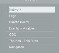
PROBLEM 2: Change the link list/tag list on the sidebar (and the nav links in the header, for that matter) to a more blocklike display. (Visuals here: the way highlighted links look now - the way I'd like them to look. navlinks highlighted as i'd like - currently they don't highlight at all.) [PROBLEM SOLVED]
PROBLEM 3: Make the tags header match the rest of the headers. Not sure why this isn't happening now. [PROBLEM SOLVED]
PROBLEM 4: In general, I'd like to reduce the margin between the link lists (both Links and Tags) and the left side of the sidebar - can't figure out how to change that, either. [PROBLEM SOLVED]
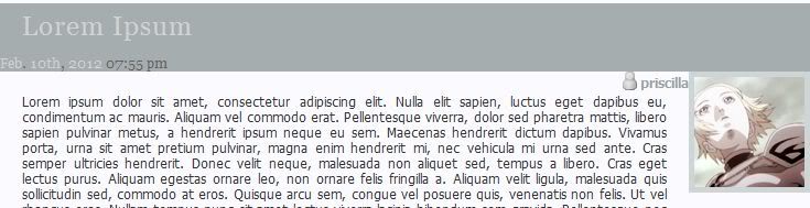
PROBLEM 5: The icon and username. This is the bane of my life - is it possible to move the icon up to overlap with the title bar, and the username to, well, under the icon? (here is what I'm going for and here is what I currently have). [PROBLEM SOLVED] (I ended up using a combination of tricks from the comments here and altering the theme layer.)
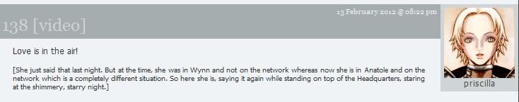
PROBLEM 6: Also visible in the above pictures, the subject line and datetime. Nothing I do seems to move the datetime from the left to the right, and is there a way to put it ABOVE the subject line instead of under? [PROBLEM SOLVED] - kind of. I couldnt get the date to work properly above the subject so i tucked it in under. Either way, it's fine.
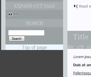
PROBLEM 7: Is there any way to get the sidebar to extend to the bottom of the page and the .pagetop link to the bottom, as well? as seen here, the link currently just hangs out at the bottom of the shortest column (also seen here) which is sort of awkward, and i'd prefer the sidebar continue long as seen onscorched_ooc.
STRANGE RANDOM BONUS PROBLEM: If you go toscorched_test you'll find that clicking a title link makes the title flash dark blue while active, as do the navlinks in the header. I CAN'T MAKE THEM STOP DOING THAT. DX I've tried various stylings on a:active for .header, .entry-title, even the general a:active but nothing seems to change it.
My current CSS, which is a bit of a frankenstein mess at the moment, my apologies.
I do realize it's a different style altogether and not everything I'd like to do may even be possible, SO if that's the case, please let me know so I can stop banging my head against it. >.<
Sorry to hit you guys with so much at once, but any help with any of these issues at all would be so appreciated I might explode.
So, okay, I've recently imported a community that I run from LJ to DW, and while I was initially using a port of Flexible Squares, I've decided to be ambitious and try to replicate it as closely as possible on a native DW style so we can use all the cool features. For the most part it's working, but there are still some quirks I don't know how to fix, or if I can fix them. So.
Layout: Tabula Rasa, style sheet disabled.
Original layout:
Current layout:
PROBLEM 1: The sidebar profile. I'd like to remove the header, center the icon and put the icon links in a horizontal list under the icon, preferably without that underline that I can't seem to get rid of. ¬_¬ [PROBLEM SOLVED]
PROBLEM 2: Change the link list/tag list on the sidebar (and the nav links in the header, for that matter) to a more blocklike display. (Visuals here: the way highlighted links look now - the way I'd like them to look. navlinks highlighted as i'd like - currently they don't highlight at all.) [PROBLEM SOLVED]
PROBLEM 3: Make the tags header match the rest of the headers. Not sure why this isn't happening now. [PROBLEM SOLVED]
PROBLEM 4: In general, I'd like to reduce the margin between the link lists (both Links and Tags) and the left side of the sidebar - can't figure out how to change that, either. [PROBLEM SOLVED]
PROBLEM 5: The icon and username. This is the bane of my life - is it possible to move the icon up to overlap with the title bar, and the username to, well, under the icon? (here is what I'm going for and here is what I currently have). [PROBLEM SOLVED] (I ended up using a combination of tricks from the comments here and altering the theme layer.)
PROBLEM 6: Also visible in the above pictures, the subject line and datetime. Nothing I do seems to move the datetime from the left to the right, and is there a way to put it ABOVE the subject line instead of under? [PROBLEM SOLVED] - kind of. I couldnt get the date to work properly above the subject so i tucked it in under. Either way, it's fine.
PROBLEM 7: Is there any way to get the sidebar to extend to the bottom of the page and the .pagetop link to the bottom, as well? as seen here, the link currently just hangs out at the bottom of the shortest column (also seen here) which is sort of awkward, and i'd prefer the sidebar continue long as seen on
STRANGE RANDOM BONUS PROBLEM: If you go to
My current CSS, which is a bit of a frankenstein mess at the moment, my apologies.
I do realize it's a different style altogether and not everything I'd like to do may even be possible, SO if that's the case, please let me know so I can stop banging my head against it. >.<
Sorry to hit you guys with so much at once, but any help with any of these issues at all would be so appreciated I might explode.
no subject
Date: 2012-02-15 12:05 am (UTC)http://wiki.dwscoalition.org/notes/Browser_Developing_Tools
no subject
Date: 2012-02-15 11:04 pm (UTC)no subject
Date: 2012-02-15 11:05 pm (UTC)PROBLEM 1
Date: 2012-02-15 01:52 pm (UTC)display: none;
}
.module-userprofile .module-content {
text-align: center;
}
.module-userprofile .userpic {
padding: 0;
width: 100px;
}
.module-userprofile ul.userlite-interaction-links li {
display: inline;
margin: 0;
padding: 0;
border: none;
}
The underline is there because you've added it yourself at some point:
.module-content li { border-bottom: 1px solid #a6adae; }
It' so easy to forget that will apply to everything. :)
An you also need to restrict the userpic styling you've got to entries/comments by switching your selector to #primary .userpic.
PROBLEM 3
Date: 2012-02-15 01:56 pm (UTC).module-tags_multilevel a, .module-tags_multilevel a:visited { color: #f0f3f6; font-family:tahoma; font-size:9pt; }
.module-tags_multilevel a:hover, .module-tags_multilevel a:active {color: #99a1a2; text-decoration: none; background-color: #e8edf0;}
The header is a link too.
If you want to restrict this to what's inside the module, you need to use a more specific selector such as ".module-tags_multilevel .module-content a".
PROBLEM 4
Date: 2012-02-15 02:00 pm (UTC)margin-left: 0;
padding-left: 0;
}
If you want to reintroduce indentation in the multilevel tags list, you need to add this as well:
.module .module-content li li {
margin-left: 10px;
}
PROBLEM 2 - Part I
Date: 2012-02-15 02:05 pm (UTC)-- Set the background to the LI tag instead of the A one:
.module-typelist li:hover,
.module-typelist li:active {
background-color: #e8edf0;
color: #99a1a2;
text-decoration: none;
}
-- Then also apply the colors to the link text even when your mouse isn't directly over the text (it's what the first two selectors are for):
.module-typelist li:hover > a,
.module-typelist li:active > a,
.module-typelist a:hover,
.module-typelist a:active {
color: #99a1a2;
text-decoration: none;
}
Same thing for the other module.
PROBLEM 2 - Part II
Date: 2012-02-15 02:10 pm (UTC).module-navlinks li:hover {
background-color: #e0e3e4;
padding: 5px;
}
.module-navlinks li:hover > a,
.module-navlinks a:hover {
color: #99a1a2;
}
PROBLEM 6
Date: 2012-02-15 02:25 pm (UTC).entry-title {
padding-top: 1.25em;
}
.datetime {
float: left;
clear: left;
display: block;
margin: -65px 0 0;
text-align: right;
width: 99%;
}
Re: PROBLEM 6
Date: 2012-02-16 01:47 am (UTC)... I can't even believe some of the sloppy mistakes I made with not specifying selectors. That's what I get for coding at 6am. /headdesk
Problem 5
Date: 2012-02-15 03:59 pm (UTC)div.entry div.userpic {
float: right;
margin-top: -85px;
}
You may have to tweak the margin to suit your particular setup. (Mine's aligned with the top of the entry title, rather than the top of the title bar.) It's not flawless, but I've been using it in my own journal and I haven't had problems with long entry titles overlapping, etc.
As for the username, I tried to do just that and stumbled over the way DW handles user tags for entries posted to communities ([user] posting in [community]). As far as I know there's no way to alter that except a theme layer, and I don't currently have a paid account so I can't experiment for you. That being said, I moved the username up into the title bar on my own journal (aligned with the date/time), which is at least slightly more aesthetically pleasing than the default behaviour. Code if you want to give it a go:
span.entry-poster {
float: right;
margin: -55px 15px 0 0;
}
Of course, that might look odd if you move the date/time around.
Re: Problem 5
Date: 2012-02-15 05:58 pm (UTC)Re: Problem 5
Date: 2012-02-15 06:02 pm (UTC)Re: Problem 5
Date: 2012-02-15 06:05 pm (UTC)Re: Problem 5
Date: 2012-02-15 06:10 pm (UTC)I really wish I wasn't currently trying to style an LJ comm so I could come play on DW where everything isn't designed to be the biggest possible pain in the ass. (Smooth Sailing uses TABLES as its main structural element I WANT TO CRY.)
Re: Problem 5
Date: 2012-02-15 06:20 pm (UTC)Re: Problem 5
Date: 2012-02-16 04:07 am (UTC)