Hello, is there any way I can use Generator layouts here on DW? I’ve seen a few people using it but can’t find any info on Google anywhere. Any help would be appreciated, thank you!
Hi
I've managed to import LJ's Opal theme in to Dreamwidth. I've set the link and visited link colour in customize options and it works for all links apart from my tags links - they seem to be invisible. Any ideas?
I've managed to import LJ's Opal theme in to Dreamwidth. I've set the link and visited link colour in customize options and it works for all links apart from my tags links - they seem to be invisible. Any ideas?
I have an imported Flexible Squares layout, but I can't tell who is who on my reading page here on DW. On LJ, the user name or community would show up underneath the userpic. What string of code in which layer will allow that to show up?
I presume it's being overwritten by something in DW layers, or because of the difference in naming between 'friends' on LJ and 'reading' on DW, it isn't showing up correctly.
I presume it's being overwritten by something in DW layers, or because of the difference in naming between 'friends' on LJ and 'reading' on DW, it isn't showing up correctly.

ETA: SOLVED. With this layout, deleting display:none from .clearfoot fixes things right up (yes, the design seems to be inadvertently coded so that it cuts off the sidebar in the three views mentioned in my post title).
Like in this example. Another user in this community had the same problem months ago (not with this style, actually a Core 2 style) and I was one of the ones who helped them, though I wasn't of much help because nothing I tried or suggested at the time really worked. Can't help myself now, either. Any suggestions?
Hi there, yet another newbie at DW here. I recently imported my highly customized Flexible Squares layout here with layout and theme layers. I changed around the bits that needed tweaking, but I got stuck on one thing. On LJ I have customized code for all icons (the 100x100 ones, not the 16x16 user icons in front of the user name) to link to the respective user's icons page. The link for entry user icons looks as follows:
<a href="$*SITEROOT/allpics.bml?user=$e.poster.username">
And this is the link for the user icons in comments:
<a href="$*SITEROOT/allpics.bml?user=$comment.poster.username">
Due to the different structure of the link to users' icons pages on DW, those links don't work here, but I'm stuck figuring out how to change them. For entries it seems to work just fine to replace the whole link with "icons", because DW will pull up the respective "username.dreamwidth.org/" part all on its own, but that doesn't work for the comment user pictures. How can I create a link to comment posters' icons pages?
Any help here would be highly appreciated.
ETA: Many thanks to![[personal profile]](https://www.dreamwidth.org/img/silk/identity/user.png) chagrined for solving this and showing me how to break up link strings!
chagrined for solving this and showing me how to break up link strings!
<a href="$*SITEROOT/allpics.bml?user=$e.poster.username">
And this is the link for the user icons in comments:
<a href="$*SITEROOT/allpics.bml?user=$comment.poster.username">
Due to the different structure of the link to users' icons pages on DW, those links don't work here, but I'm stuck figuring out how to change them. For entries it seems to work just fine to replace the whole link with "icons", because DW will pull up the respective "username.dreamwidth.org/" part all on its own, but that doesn't work for the comment user pictures. How can I create a link to comment posters' icons pages?
Any help here would be highly appreciated.
ETA: Many thanks to
Accounts in question: nightfall_mods and its related accounts (links are in the sidebar.) Currently layout-testing on sanguine_saint where there's a ton of comments on the layout-test page, for convenience's sake, too. (Er... been using ?style=mine; I'll throw the layout up on that account in a min.)
Issue: There's no Expand link, in collapsed comments. I'd like there to be, but I'm only just now dipping my toes into S2 (core version 1, Style Contest from LJ. Well, specifically, from IJ.)
( Read more... )
My apologies if I've left out something relevant (let me know, and I'll happily provide it!) and thanks in advance for any advice/pointers!
Layer code is here.
Problem solved! There was a problem with my theme layer that was keeping the quick reply box from working. I found another version of the theme layer code by
I hope this is the right place to ask about this--
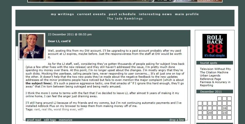
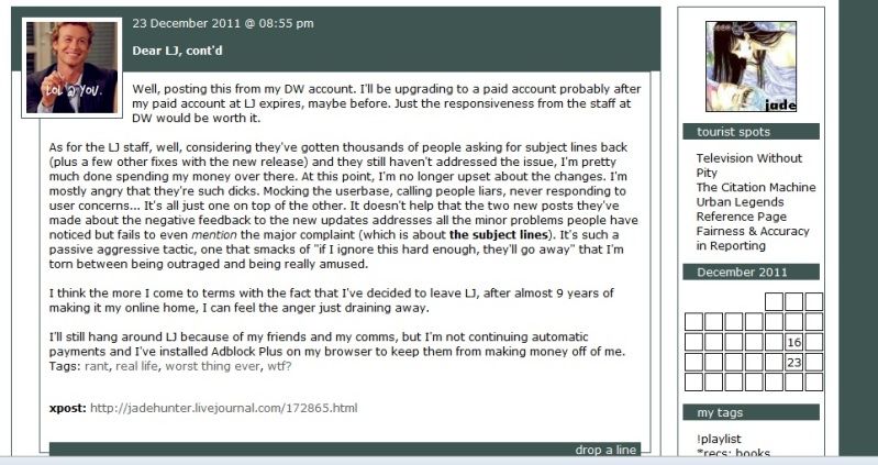
I was wondering if there is a way to edit the "xpost" section to fit in line with the tags and mood/music/etc. on a layer that I'm using an LJ layout on? That, or stop it from displaying at all, if I have to.
I was wondering if there is a way to edit the "xpost" section to fit in line with the tags and mood/music/etc. on a layer that I'm using an LJ layout on? That, or stop it from displaying at all, if I have to.
I really hope someone can help me!
I'm using the port of Flexible Squares, and I brought my old layout with me. The problem is that it uses images for navigation. On LJ, the active page shows in the nav module like this:

But on DW, the active page disappears from the nav, leaving me with this:

I feel like I'm overlooking something.
Any help would be much appreciated!!
I'm using the port of Flexible Squares, and I brought my old layout with me. The problem is that it uses images for navigation. On LJ, the active page shows in the nav module like this:
But on DW, the active page disappears from the nav, leaving me with this:
I feel like I'm overlooking something.
Any help would be much appreciated!!
Another LJer who left over release 88...
I've got the Flexible Squares style (using this fix). It's all working fine, except usernames aren't displayed below userpics on my Reading Page, and the subject lines for entries aren't links. I'm assuming it's a CSS problem but I don't understand CSS in the slightest so any help would be fantastic!
Hi,
I've recently imported the Flexible Squares style from LJ with some help from some truly amazing tutorials, but I've found myself with an issue that I can't seem to find an answer for on my own.
Basically, this is how a typical post looks to me on LJ. There are three links on the left bottom corner of the post, one to edit the post, one to edit tags, and one to add to memories.
And this is the same post on DW. There are no links here at the bottom left corner.
Can anyone tell me how I can get the 'edit post', 'edit tags', and 'add to memories' links to show up on my DW posts like they do on LJ posts?
Thank you.
ETA: SOLVED
[ETA]: Solved!
Hullo!
I'm not so much an LJ refugee as that I keep an outpost on DW just in case. My layout over there has a lot of personal customzations - it's not one of the public themes; it's something I did the graphics and colours for myself, and not being able to reproduce it has been one of the things that's kept me from wanting to be as active on DW as I am LJ.
Well, I only just tonight found out that there's a tutorial on importing LJ styles (this one here, using the instructions for a Mixit import). While I have the layers created and compiled okay, I have run into one minor(?) problem... On LJ, I'm using Expressive as my base, which I'd gotten the impression was more-or-less the same as Mixit so I thought it might work alright. Apparantly there are more differences than I realized, because while the basics of the layout are there, there are features that have shifted around - the links specific to each entry are now in vertical colums rather than horizontal lines, as are my header links, and my sidebar is appearing at the bottom of the page (after my entires). (That's probably an obvious enough explanation, but in case it's not, this is how it looks on DW, and this it how it looks on LJ).
I don't generally mind trying to tweak things when I know what it is what I actually need to tweak, but I don't have the kind of mind that'll let me paw through code and find the problem. I'm assuming it's either an issue in the CSS somewhere (though I could be wrong) or there's an adjustment I could make to the CSS to compensate for the base code, but it's all just too much like an algebra problem for me and my dyscalculia to figure out. :/ Does anyone have suggestions for what I might be able to do to fix it, or know of a fix that's already in use - preferably one that doesn't involve having to switch to Mixit on LJ, trying to recreate the layout there, and copying it back to here? (Or is there a local style that might be suited to rigging a similar look on DW? I did glance through the themes here, but didn't see anything that seemed to be a good fit. I'm not averse to some changes, but I'd like to keep my header graphic/page background and colours/etc - and a lot of the local styles also have entry boxes that get squashed due to my monitor's resolution being on the lower end.)
[ETA]: Getting the links onto their lines seems to be more-or-less handled, now, so I'm left with:
- The sidebar not positioning properly
- Entry tags vertical-columning (though I suspect I may know how to fix this eventually, if I play around with things enough - now that i see how the link lines were fixed)
Also, the subjects aren't turning into links to individual entries.
I could do without the latter if necessary, but being able to see people's names and communities is vital. Any ideas on how to fix this?
Thank you,
While I'm here, does anyone know if it's possible to import the LJ layout Magic Paper?
Thank you in advance~
God, I hope this works.
I have been trying to reply to individual comments, and apologise individually, and I have not been able to get a reply to post, so, although I know I should apologise to each of you individually, I am going to have to place this in the post itself.
I'm sorry. I can say that I'm very tired and stressed, which I am, but the truth is -- I was rude and out of line, and I put my foot in it. I'm sorry.
Hi there. *waves* I've just been through the available DW layouts, and I hate them all, except for some that I merely don't like. Way too much empty space (eek, it looks like the new LJ comments pages!), colours that bother my eyes, strange all-cappiness, etc. Unfortunately, although I have mad skillz in some areas, I don't know how to do custom styles or css, and I have a bit too much on my plate to attempt to learn it right now.
Instead, I'm going to be terribly shabby and shallow and try to bribe someone to help me.
On LJ, I used the following layouts:
Bluetiful, a Components theme, on![[livejournal.com profile]](https://www.dreamwidth.org/img/external/lj-userinfo.gif) lolmac
lolmac
Desert Fire, a Minimalism theme, on![[livejournal.com profile]](https://www.dreamwidth.org/img/external/lj-community.gif) bethinexile
bethinexile
Writer's Block Powder, an Expressive theme, on
"rdadailylayout", a customised version of Smooth Sailing, on
I will give a year's Paid account DW points to anyone who can do a reasonable replica of these layouts (a year's time for each layout). If you're able to make the layout available to DW generally, I'll be especially happy, because that will hopefully gladden the hearts of more refugees.
I have been trying to reply to individual comments, and apologise individually, and I have not been able to get a reply to post, so, although I know I should apologise to each of you individually, I am going to have to place this in the post itself.
I'm sorry. I can say that I'm very tired and stressed, which I am, but the truth is -- I was rude and out of line, and I put my foot in it. I'm sorry.
Hi there. *waves* I've just been through the available DW layouts, and I hate them all, except for some that I merely don't like. Way too much empty space (eek, it looks like the new LJ comments pages!), colours that bother my eyes, strange all-cappiness, etc. Unfortunately, although I have mad skillz in some areas, I don't know how to do custom styles or css, and I have a bit too much on my plate to attempt to learn it right now.
Instead, I'm going to be terribly shabby and shallow and try to bribe someone to help me.
On LJ, I used the following layouts:
Bluetiful, a Components theme, on
Desert Fire, a Minimalism theme, on
Writer's Block Powder, an Expressive theme, on
"rdadailylayout", a customised version of Smooth Sailing, on
I will give a year's Paid account DW points to anyone who can do a reasonable replica of these layouts (a year's time for each layout). If you're able to make the layout available to DW generally, I'll be especially happy, because that will hopefully gladden the hearts of more refugees.
Yep, I'm another refugee from Livejournal. And, while I figured out 99% of the tweaks to import Smooth Sailing into DW, I cannot for the life of me figure out how to make user & community names show up on my friends' list.
My CSS:
Original CSS
My CSS:
Original CSS
I was wondering if anyone had a fix for this ... I was helping a friend (tiltingheartand), who wanted her DW layout to look exactly like her current one on LJ. The style she uses on LJ is "Quite Lickable," and I was able to find a coding adaption for a S2 layer style over here.
I haven't had any trouble tweaking small things here and there, but I can't seem to figure out out to hide the links for memories and tags in the sidebar. (For the record, I don't know how they're hidden on her LJ either, since I'm not very familiar with the QL style.) I tried using the two fixes suggested here, but neither of them has worked for me.
If anyone knows a way to fix this, I would be very much appreciative. :)
Layer coding:
Child layer coding:
I am having two issues with this layout (here is the layer).
First, I would like to make the entry subject lines permalinks and no amount of googling has lead me to a fix on this for Smooth Sailing, though I have found one for Flexible Squares.
Second, the font of the subject line is supposed to be larger in that layout, but for some reason, it's not displaying properly in the layout.
Any help would be greatly appreciated. Thank you very much!
Hello, I've put Flexible Squares in my layer styles but when I try to choose that layer for a community I can't find the custom layer (but I can on my personal journal). Is there a way to use Flexible Squares for communities?
Thanks in advance!
Thanks in advance!