extempore (![[personal profile]](https://www.dreamwidth.org/img/silk/identity/user.png) extempore) wrote in
extempore) wrote in ![[community profile]](https://www.dreamwidth.org/img/silk/identity/community.png) style_system2012-03-14 05:42 pm
style_system2012-03-14 05:42 pm
Entry tags:
Header custom menu, User Name size and position
Hello fellow style addicts!
I recently moved in from LJ and I'm in the process of recreating my journal layout at DW. I'm using the Brittle layout and trial/error my way through the design. ;) Most things I managed to work out by myself, but there are a few points I can't seem to find a solution for. Hopefully someone will be able to point me in the right direction. Additionally, I'm not sure what tags would be appropriate for this post. I'd be relieved, if the mods could handle that. ^^;
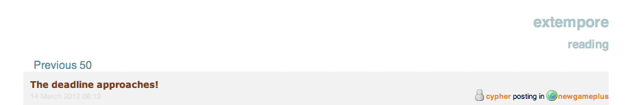
1.
My header looks like this. What I'd like to have is instead of the journal name/page title to show a simple link menu I can freely configure, such as:
2.
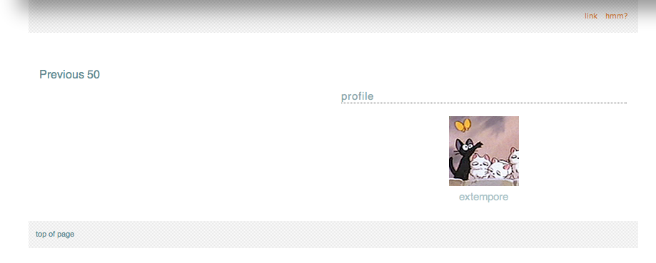
I'd like to move "Previous 50" to the right and to change the font size. So far I only managed to find out how to change the color. I'd like to do the same on the bottom of the page. (Currently the profile module sits there as well. I disabled it for now, because my first plan had been to put it in the header, which didn't work and the entire thing would have been too big for the top of my page anyway.) --- SOLVED!
3.
Is there a way to (a) change the font size of user names independently from the font size for date/time? Also, is there a way to (b) place the user names below their icons in such a way that they behave "intelligently", i.e. have line breaks, if the name length exceeds a certain amount of letters? This is mainly interesting for communities when you have "userblabla posted in communityblabla". I found out how to change the positioning in general, but I assume the user name would have to be withing the icon layer to be confined to it and for the entry text to not overlap it, and I couldn't figure out how to do that or how to add another box below the icon in which I could put the user name. --- Part (a) solved!
Thank you in advance for any help you can offer me! (Also: please ignore the white page background, I'll be adding a background image once everything sits on its right place.)
I recently moved in from LJ and I'm in the process of recreating my journal layout at DW. I'm using the Brittle layout and trial/error my way through the design. ;) Most things I managed to work out by myself, but there are a few points I can't seem to find a solution for. Hopefully someone will be able to point me in the right direction. Additionally, I'm not sure what tags would be appropriate for this post. I'd be relieved, if the mods could handle that. ^^;
1.
My header looks like this. What I'd like to have is instead of the journal name/page title to show a simple link menu I can freely configure, such as:
profile | circles | calendar | link a | link b
I found in this lovely community already how to get rid of the page title etc. What I don't know is how I could put links there instead, and perhaps my profile icon in a smaller size. --- Partially solved!2.
I'd like to move "Previous 50" to the right and to change the font size. So far I only managed to find out how to change the color. I'd like to do the same on the bottom of the page. (Currently the profile module sits there as well. I disabled it for now, because my first plan had been to put it in the header, which didn't work and the entire thing would have been too big for the top of my page anyway.) --- SOLVED!
3.
Is there a way to (a) change the font size of user names independently from the font size for date/time? Also, is there a way to (b) place the user names below their icons in such a way that they behave "intelligently", i.e. have line breaks, if the name length exceeds a certain amount of letters? This is mainly interesting for communities when you have "userblabla posted in communityblabla". I found out how to change the positioning in general, but I assume the user name would have to be withing the icon layer to be confined to it and for the entry text to not overlap it, and I couldn't figure out how to do that or how to add another box below the icon in which I could put the user name. --- Part (a) solved!
Thank you in advance for any help you can offer me! (Also: please ignore the white page background, I'll be adding a background image once everything sits on its right place.)
And use the edit code, not the code in my 1st reply...
#canvas {margin: 0 0 0 70px;}
I really hate using CSS shorthand, for what it's worth, on margins and padding. I write it out longhand most of the time because it's easier for me to override existing margins and padding with commands like
{margin-left: 70px;}then to try to remember that from left to right the four numbers control the top | right | bottom | left of the element I'm adjusting.Re: And use the edit code, not the code in my 1st reply...
Ah of course. *headdesks* It works now like a charm, thanks!